Case study
Abbana
Rebranding & new website
Repositioning a brand into its future.

The project
Support: clients of course, with a strong sense of service, but also employees, with the closeness and guidance so dear to the brand. Expertise: the central and perfectly logical idea for a company of engineers and tech experts. We had to inject notions of innovation and dynamism into our creations.
A rethought visual identity
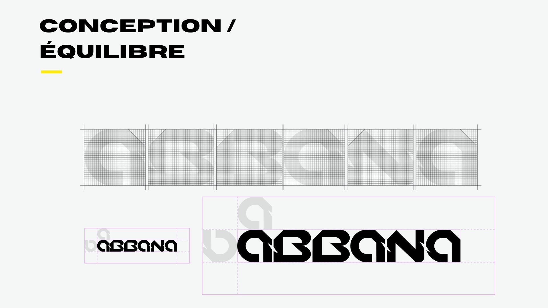
To convey these ideas implicitly through colors and shapes, we produced multiple proposals, and the breakthrough first came with the typography.
Our aesthetic direction: bring Abbana's brand image more charisma through assumed ultra-modernity.
- Straight lines, symmetry (expertise, precision, rigour = trust)
- But also roundness (closeness, human touch, client support, training…)
- Frames, structuring blocks (support, training, legibility, organization, engineers)
- 45° angles (dynamism, modernity, sci-fi codes)
Creating a modern website
You know the story with us. We love rebranding companies, but we love just as much going all the way by creating the website that goes with it, the social-media charter, etc.
We warmly recommend visiting their new site www.abbana.com, to savour that modern yet hushed atmosphere.

Signage and applications
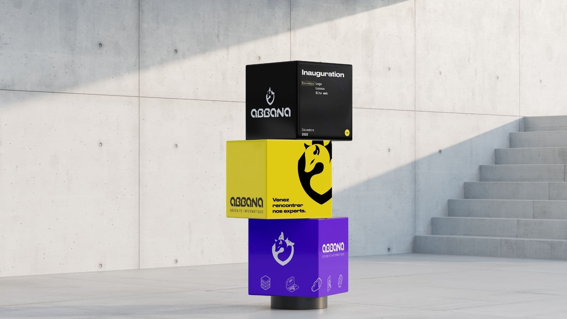
Abbana's rebranding was also rolled out across signage, physical materials and all the brand's applications.
Final result
The result of this collaboration is a strong, distinctive brand identity that positions Abbana as an innovative player in its sector. The new website offers a smooth, engaging user experience that showcases the company's services and expertise. The creative approach and the use of modern graphic elements created a coherent world that perfectly reflects Abbana's positioning: high-level technical expertise combined with human, personalized support.
One year later…
Abbana has been acquired and now belongs to the REEVO group.
.jpg)
.jpg)

A project in mind?